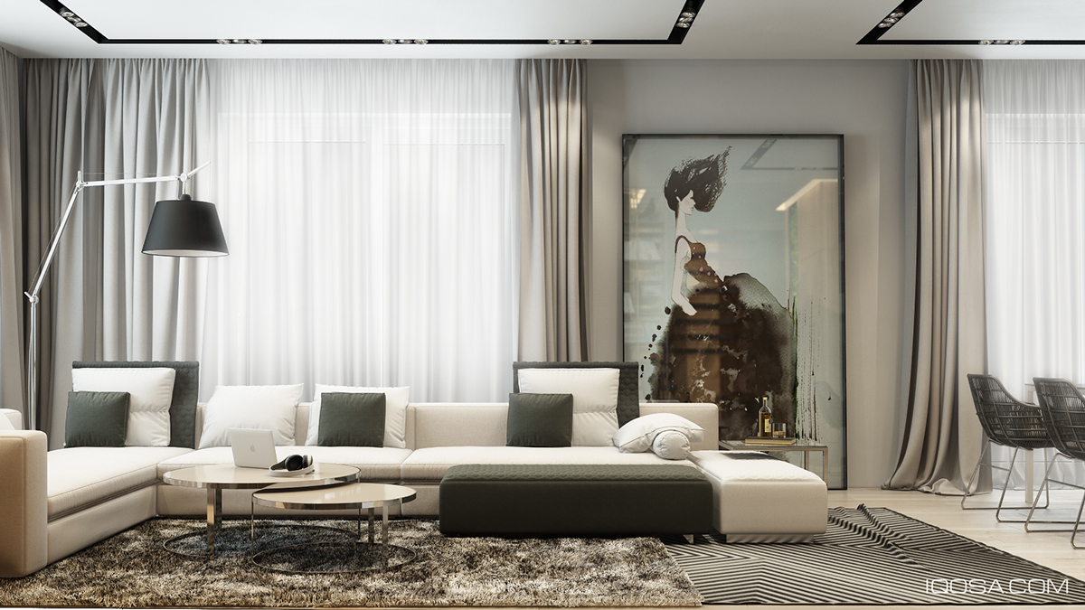
Color is not the only way to make a space visually interesting. In fact, when too many vibrant colors come into play, it is easy for a space to get a busy, crowded, and distracting. This Moscow home, as visualized by Iqosa, instead chooses to stay with a neutral color palette, consisting largely of dark grays, creams, black, and a bit of gold. To bring more visual interest into the space, texture is used heavily throughout the design.
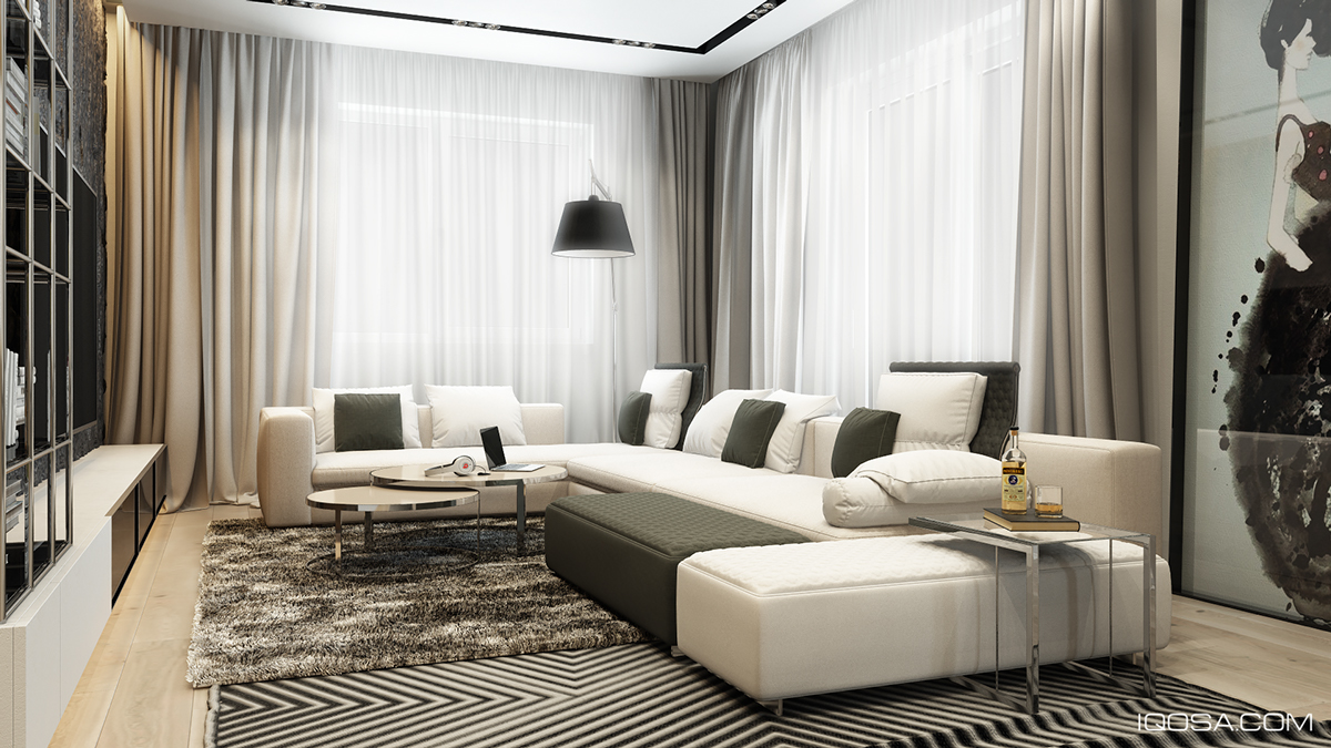
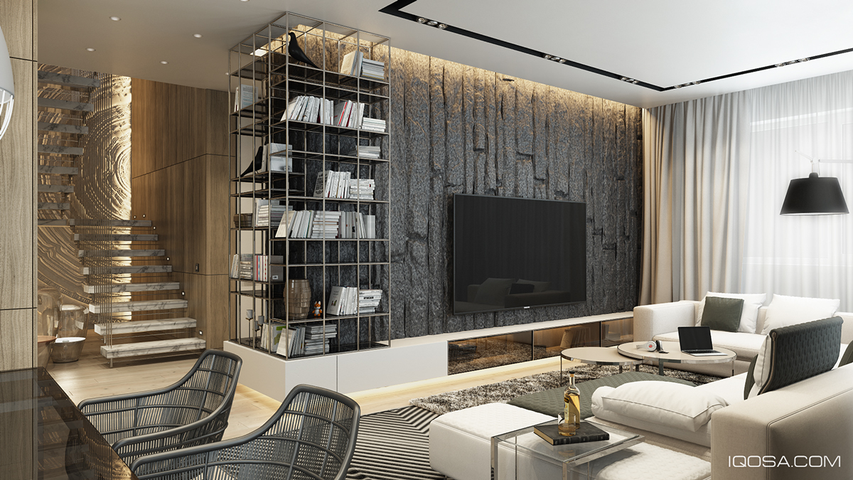
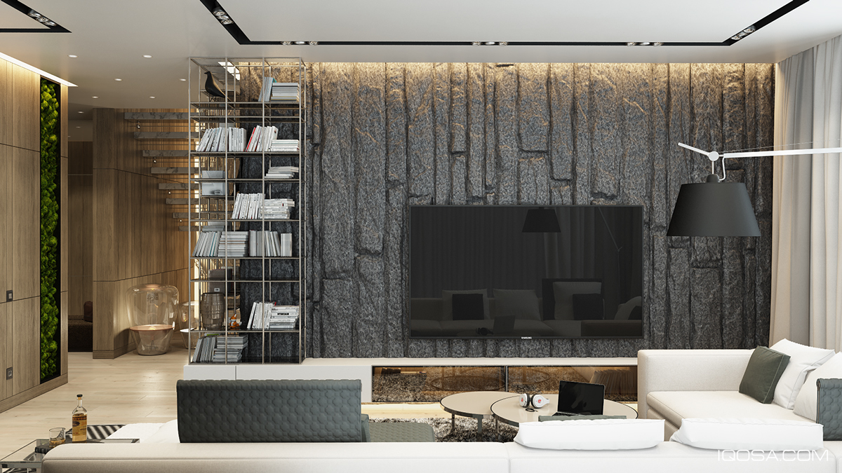
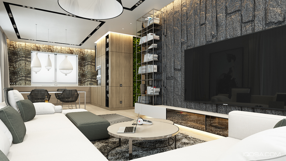
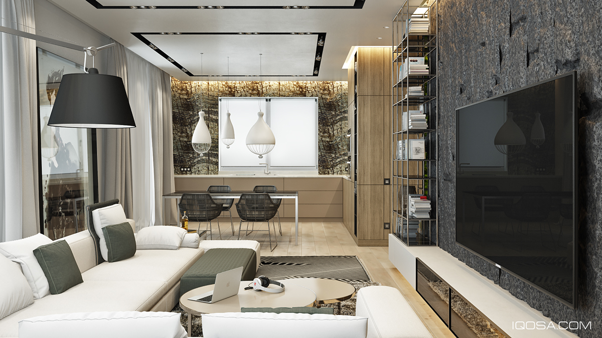
 1 |First up is the living room, which centers on a large, smooth sectional sofa that faces a television. The flat panel screen is hung on a craggy stone wall, with the visible texture both helping to camouflage the television and to create an interesting dynamic between the smooth surfaces of the sofa and its opposite wall.
 2 |
2 |
ADVERTISEMENT
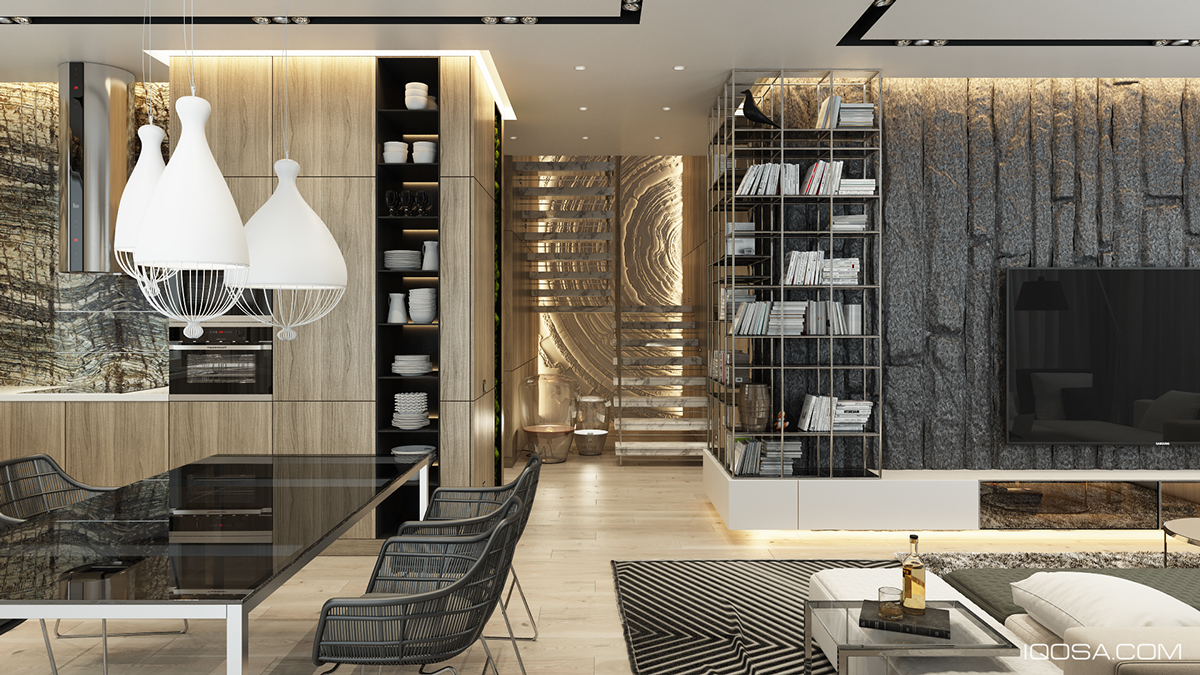
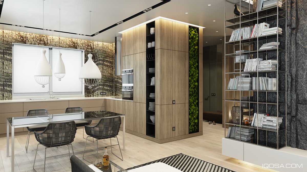
 3 |In the adjacent dining and kitchenarea, texture continues to weave its way through the story of the design. For instance, the deep dining chairs use a wire frame that takes the place of the standard Eames-style smooth, molded chairs while the table they surround shines with a smooth glass finish.
 4 |
4 |
 5 |
5 |
 6 |
6 |
 7 |
7 |
 8 |Next to the dining table, smooth wood paneling contrasts with a vertical garden, in both color and texture
No comments:
Post a Comment